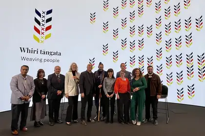
L-R: Te Taku Parai, Rongomaiaia Te Whaiti, Paora Ammunson, Margaret Maile, Helmut Karewa Modlik, Kurt Smith Komene, H.E Nicole Menzenbach, Deputy Head of Mission Winnie Switakovski, Matthijs Siljee, Zofia Seymour and Maihi Potaka
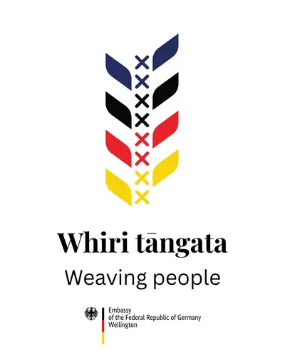
The tohu, Whiri Tāngata Weaving People, powerfully embodies the connection between the two countries. German Ambassador Her Excellency Nicole Menzenbach intends to use the symbol alongside Germany’s national emblem throughout her embassy’s activities in New Zealand.
Whiri Tāngata Weaving People was designed by professional graphic designer Zofia Seymour in partnership with mixed media artist Maihi Potaka of Ngāti Hauiti, Ngāti Manawa, Te Ātihaunui-ā-Pāpārangi. Zofia is half German and half Kiwi and has been involved in campaigns for several prominent Kiwi brands in her work as a commercial designer.
Maihi is a graduate of Massey University’s Māori visual arts programme and has been involved in numerous art collaborations with communities and businesses.
The new tohu was unveiled to a large audience of German Embassy staff and invited diplomats, as well as staff and students from Massey’s Toi Rauwhārangi College of Creative Arts in the Great Hall of the former Dominion Museum building last week.
During their presentation, Zofia and Maihi explained how Whiri Tāngata Weaving People embodies the connection between Aotearoa and Germany, binding their histories, people and shared futures through the art form of tukutuku and celestial navigation.
Her Excellency Nicole Menzenbach thanked Zofia and Maihi for their collaboration, which ensured a much deeper understanding within her embassy of mātaurangi Māori.
"With this celebration, we reveal not just a beautiful design, but we reaffirm our shared commitment to partnership and community – one built on trust, creativity and a deep respect for one another’s stories.”
The collaboration between Zofia and Maihi was facilitated by Massey School of Design Senior Lecturer, Matthijs Siljee. He helped the German Embassy to establish a work group and undertake a design process that retained the original intent of the client and enabled the representation of all cultures involved.
“The success with this experience of bringing cultures together affirmed that good design must always be undertaken with others, not for others,” says Matthijs Siljee.
The meaning behind Whiri Tāngata Weaving People
The design draws on the intricate process of weaving, where every tukutuku panel requires two people, one on either side passing the strands through to create a unified pattern. This act is a metaphor for the partnership between the two nations of New Zealand and Germany, emphasizing the necessity of working together to create something strong, meaningful and enduring. Just as tukutuku is impossible to weave alone, so, too, is the relationship between Aotearoa and Germany built upon the exchange of knowledge, support and respect.
Stars were the original guides of Māori navigators, lighting the way across vast oceans, ensuring safe passage to new horizons. In this design, the purapura whetū (crosses) echo the celestial pathways that once connected early Māori navigators from Hawaiki to Aotearoa. The stars remind us that, though separated by great distance, our destinies are linked through shared ambition, curiosity and the pursuit of excellence.
The composition of the motif can also be interpreted as a stylised wheat stalk, a symbol of nourishment, peace and unity in a German context, evoking the act of breaking bread as a gesture of hospitality and connection. This adds another layer of meaning, emphasising the shared values of sustenance and harmony between the two nations. Simultaneously, the form can also be seen as a fern leaf, a deeply significant symbol in Aotearoa, representing growth, resilience and identity. These dual interpretations highlight the weaving together of cultural narratives, reinforcing the interconnectedness embodied in the design.
Colour plays a vital role in reinforcing these connections. The black, red and yellow acknowledge Germany’s heritage, while the blue, red and white reference the New Zealand flag. The black, red and white symbolise Māori identity and unity. Together, these colours reflect the strength of both nations and the shared values that connect them.
Related news
Auxetic kōwhaiwhai designs bring new dimensions to kiwifruit growers
Māori artist Maihi Potaka and packaging expert Dr Eli Gray-Stuart have collaborated to created Māori-inspired, auxetic packaging for kiwifruit.

Design student awarded prestigious Māori scholarship
Macy Cribb has recently been recognised with the 2025 Hinemoa Hilliard Memorial Scholarship —an award that honours excellence, leadership and the legacy of Māori wāhine in higher education.